
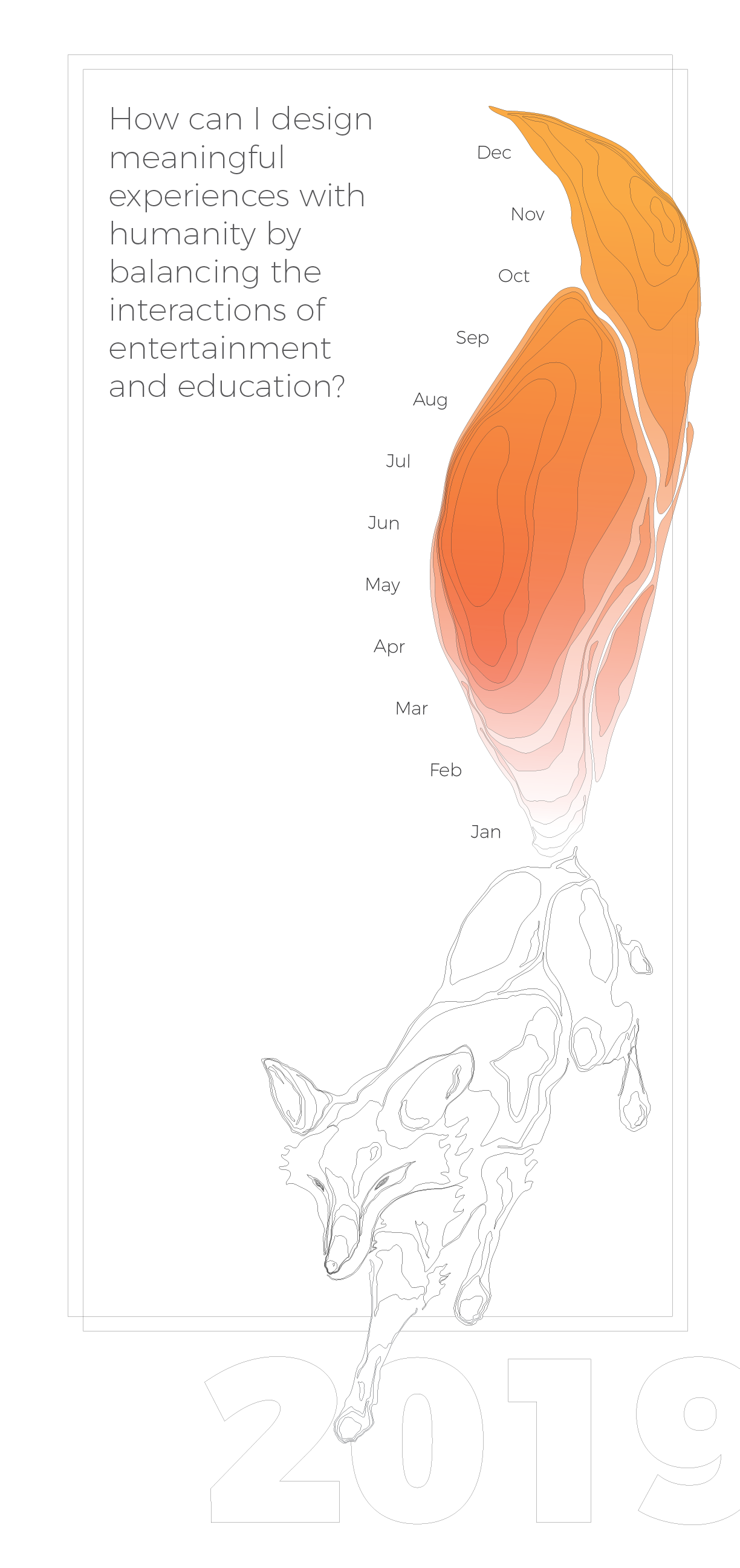
2019 Calendar
Problem statement
Creative work reaches deep into our intuitive and unconscious minds, into our hearts and feelings. The sea change design process helped to define your calling and its embedded meaning. Now you will examine the ways in which this abstract idea can be interpreted and represented in visual form, offering clarity, embedded meaning and understanding to the viewer. Stay away from literal translation and use metaphors and story telling for your design.
Emphasis will be placed upon original concept development and the exploration of diverse processes, techniques and methods. you will be expected to experiment and explore, thereby expanding on your visualizing skills.
What worked well
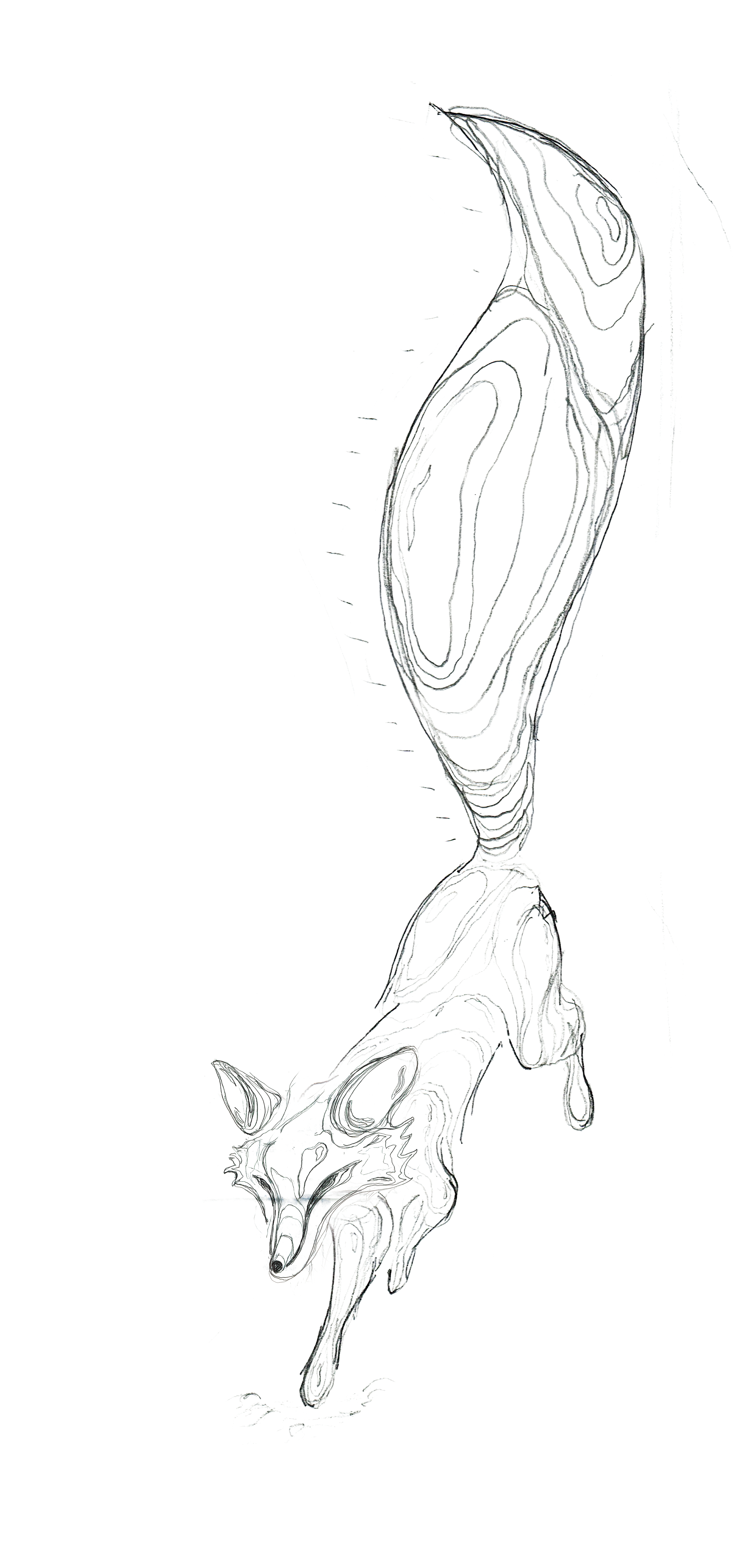
This calendar was designed with the intention of sharing an opportunity with my niece and nephew, so that the negative space could welcome the coloring utensils of a child. The fox went through several adjustments in order to get the intended movement and lightness that I was searching for, The challenge of working with complete shapes was difficult but the reductive qualities communicated the dimensional aspects of the fox while using a uniform stroke length.
What did not work so well
During the project, I was somewhat hindered by certain rules I set up for myself when illustrating the fox. Some of the smaller line details didn’t come out as refined or uniform as I had hoped. As a stand alone piece, color would need to be really important to be added in, and therefore a the orange felt necessary to be added. The simpler typographic placement helped with readability, but sacrificed a dynamic interaction between the imagery and type. The use of a uniform stroke length was a limiting factor, and varying stroke lengths could potentially provide an added layer of depth. More experimentation with different rules for different textures of fur could also be pushed further, but that would be comparative.
What was learned
I learned to experiment with different illustrative methods and to further think about how this piece would be experienced over time. I felt that this was good exercise working with line spacing to provide texture and weight. I learned how important consistent rules and specific decision making can impact an image’s understandability from a distance. Also a more careful consideration of the use case is very important. From a distance the white poster is not easily understood, but the intended “coloring book” use works because it requires the piece to be first experienced at close proximity, and would then transform to a different experience at a distance.
Writing the calling intention helped really helped me as a designer really try to think of new ideas based on what kind of experience I want to design, and how my specific interests influence my process. I also learned to take a step back from focusing on small details and remind myself to think about the overall message I want to convey.