
Building awareness.


Brief
Design an orihon style folding booklet visualizing the unique personality and character of your interview partner and their relationship to nature, specifically around water. collect information (see questions below) about him/her in order to interpret and transform the research into a compelling design using storytelling, poetry, quotes, lyrics etc
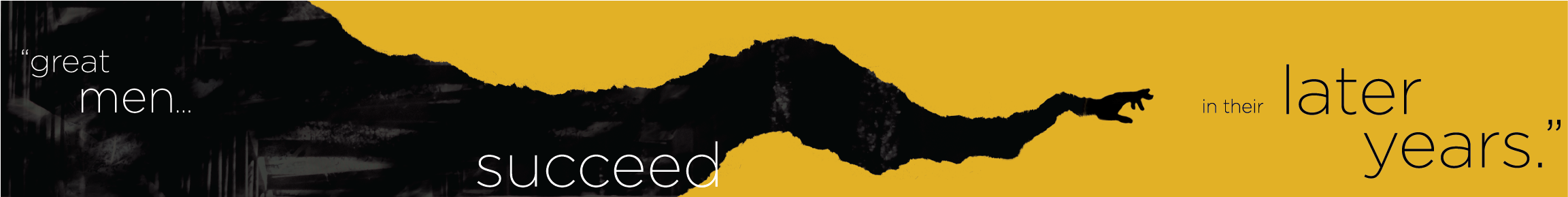
Front Panel
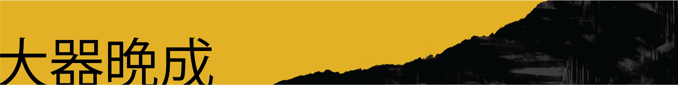
Rear Panel
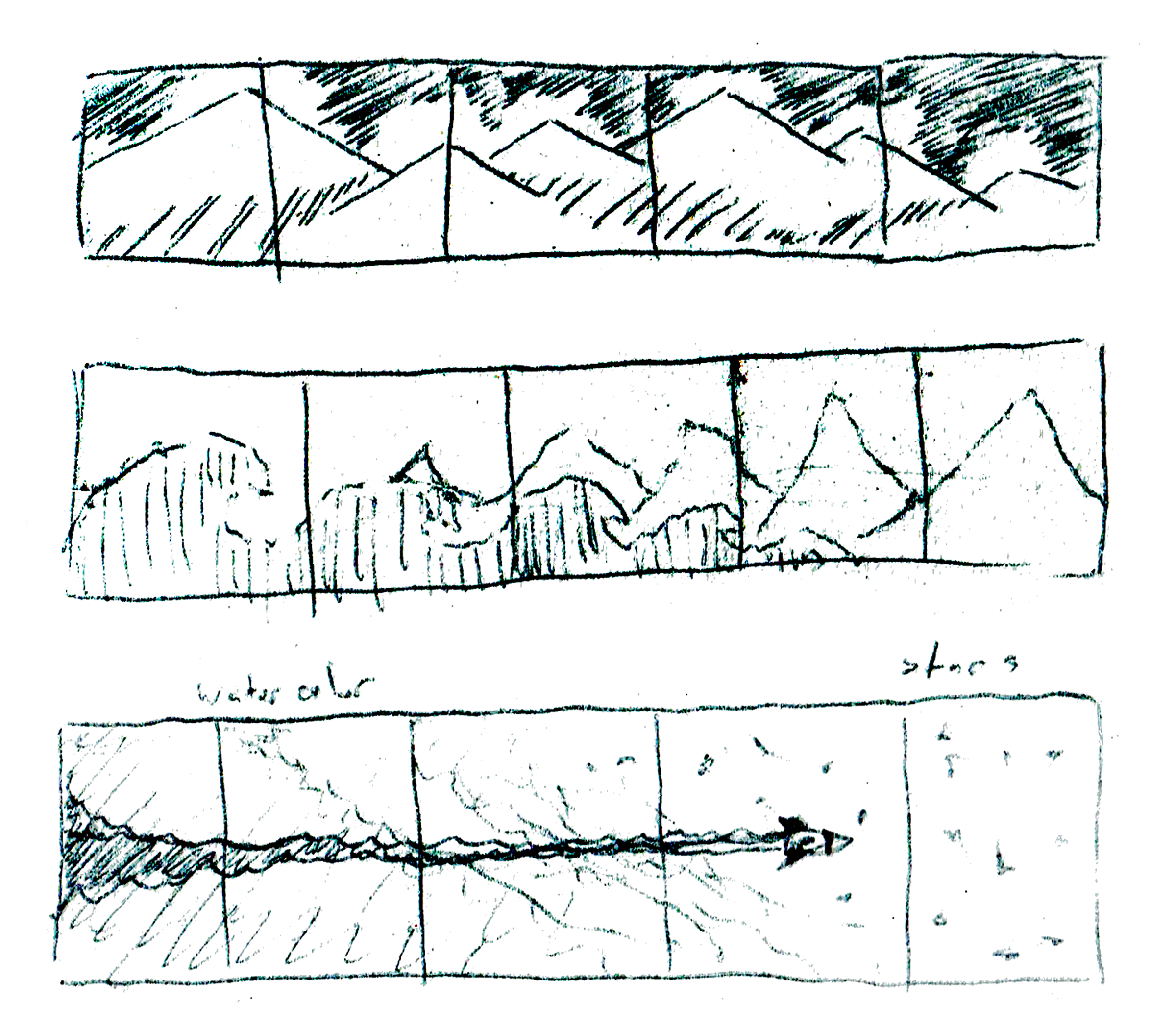
early sketches
What worked well
Using the information learned from the interview, the project was able to pull a variety of different concepts together to describe my interviewee. The influence of designer Saul Bass, his father, and Japanese animation storytelling was combined to tell the story of my interviewee. The project was able to include the aspects of storytelling that was appreciated by the interviewee, where the back used their appreciation for mountain ranges, subtly referenced by the hand torn paper styling, their favorite color. The high contrast between the black and yellow helps emphasize the forms of the hand reaching, where the quote choice helps describe the interviewee’s own journey through life.
What did not work so well
By the end of the project the final print was printed on a gloss finish. Given the subject and concept a non-glossed or matte paper type would have been more beneficial, or experimenting with colored paper types to bring out more of the vibrancy of the color. The Japanese characters could possibly benefit from hand lettering as well as achieving a better balance of weight between the two type styles. The black potions lack a deliberate enough use of texturing that the project could benefit from in leading the eye across the page. The back side of the project could benefit from more deliberate or obvious mountain forms. Incorporating textures relating to stars or the night sky could help further personalize the project to the interviewee’s interests.
What was learned
I learned that there is a variety of different stylistic approaches that could have been taken to this project, and that being as thorough as I could be in taking notes during the interview was crucial. Collecting as much data as possible and then grouping what key phrases sparked interest or imagery when paired together. Synthesizing the data was the most beneficial tool early in the project. Another challenge was designing for such a wide rectangular form meant that how a view would experience the object across the entirety of the page as well as with how the images interact with the folded angles. Building a good relationship with understanding your printing considerations was also important, because the project needed to be printed front to back and then constructed, so there was a lot of trouble shooting for what formating issues arose.